As the pandemic starts, many school has yet to decide which schooling platform that suits them the best. An online platform allows them to monitor students and do usual school task in one place. They are neat, but they are prone to mistake. In this post, we are going to look over at mySchool, a platform that my school decides to go with.
Introduction
On July 19th, we were introduced by this platform, called "mySchool". When we open up the url, we are greeted with this look:
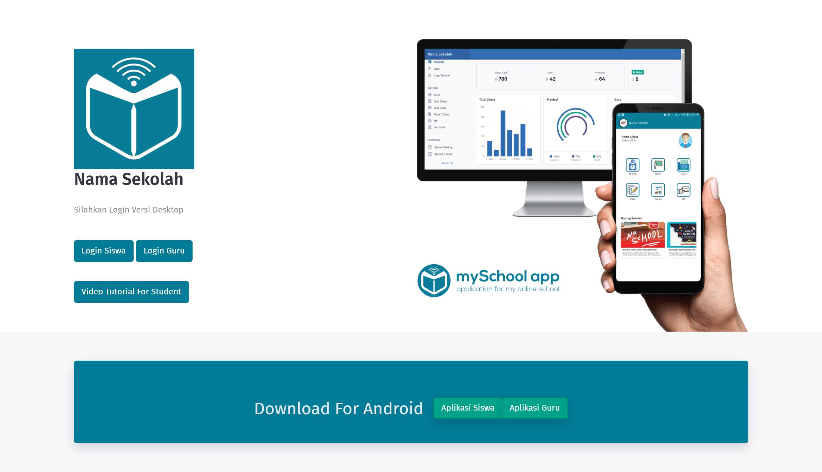
May not be the best looking site, but that's alright. Here, we were asked to install the application that is available there. Of course, there is something off even just by glancing to it:
There is an Android application for this, but what about iOS?
And to no surprise, their answer was "There is no iOS application, feel free to use the web version of it, though." Which is totally fine, so far there doesn't seem to be nothing really weird going on.
The Platform
Web Version
Upon logging in, you're greeted with a nice fancy admin styled page.
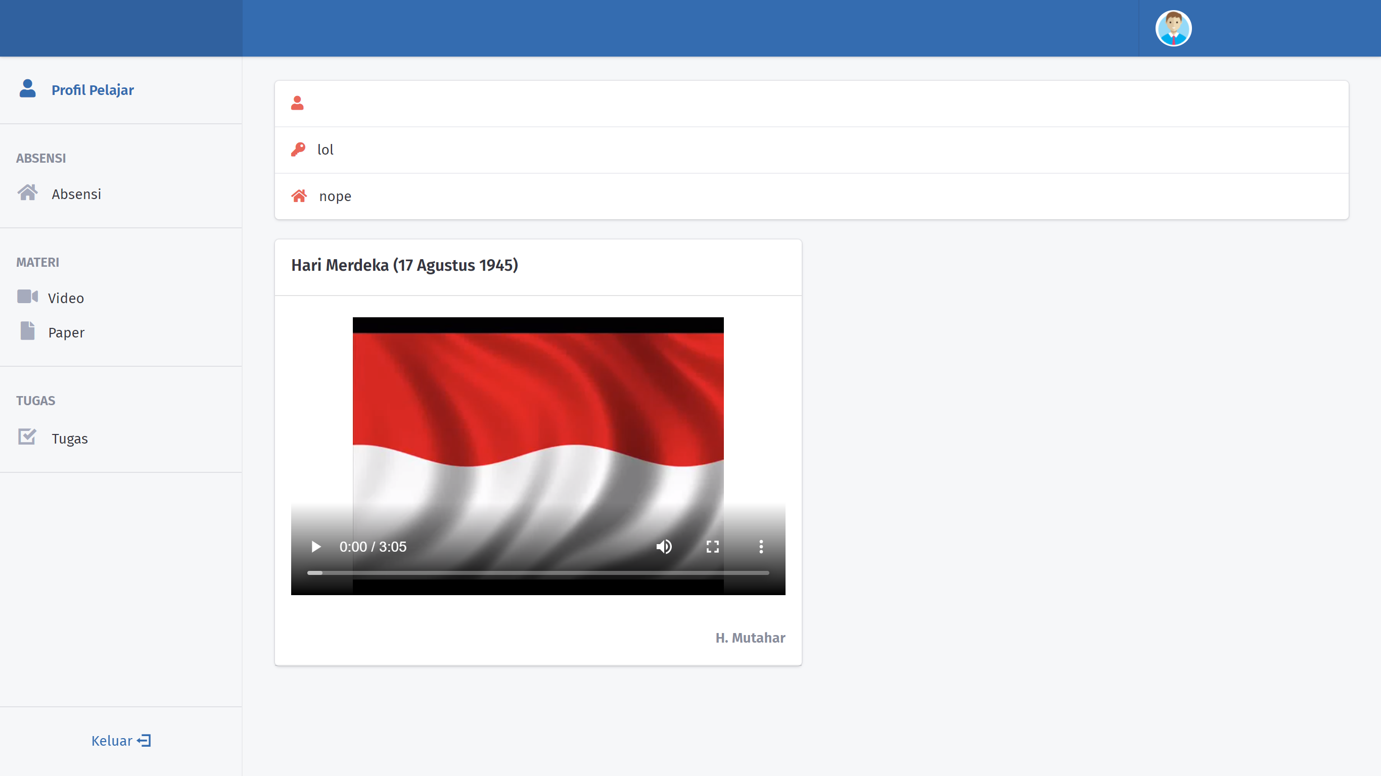
Right off the bat, there is already something odd. The password is shown in plain text. In general, you do not want your password saved in plain text, let alone showing it right in the face! This already shows us how questionable the design choice of their backend. Though, I should give them some kudos on making the interface decent.
Android Version
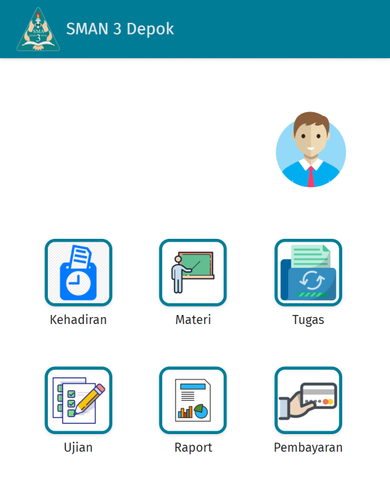
The mobile UI looks alright, it looks simple and straightforward. There is nothing to comment here.
However, if you didn't notice it already, there are some extra menus. They are Ujian (Exams), Raport (Report Card), Pembayaran (Billing). We do not need to care about anything but the Exams page, as the rest of it are unused for my school's case.
Exams
Access to Page
Now, you may be wondering, why is the exams page only available for Android users? What about students that don't have an Android device? From here we can guess many things, perhaps:
- they have an anti-cheat system in place for the application;
- they don't want their students to do it in PC, as it is easier to cheat by opening a new tab;
These guesses are valid, but...
There is no anti-cheat system.
The application itself is nothing but a WebView, pointing to the domain of the platform. Don't believe me? Look at it yourself!
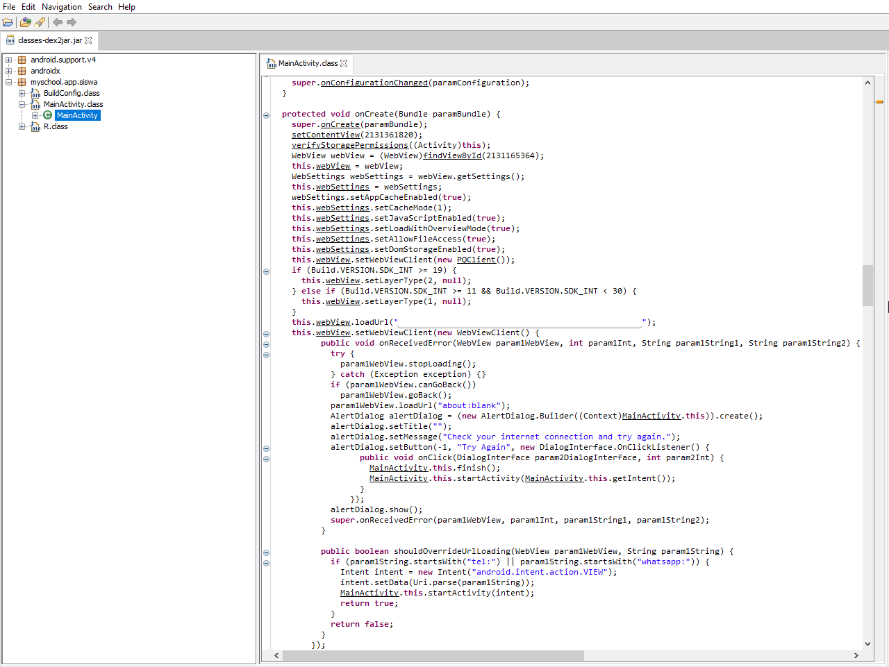
As you can see, it is essentially a WebView, and nothing else.
You can still open the page in web version.
Yes, you can still open it. It is just poorly hidden. One could go to Materi -> Video and the option to go to Exams page should pop up.
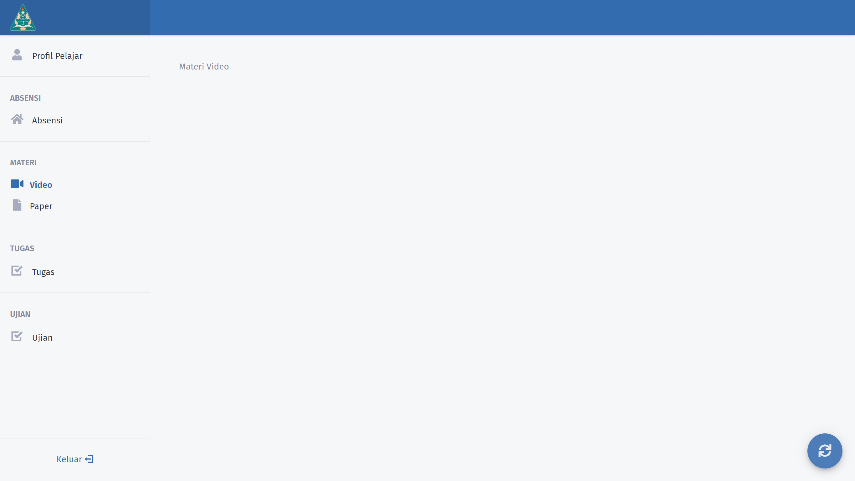
So, what is the point of all of this? The world may never know.
Introduction and Flaws
Upon opening the exams listing page, you are greeted with the list of exams being assigned. Standard stuff. Then, when you load up the exam page, you will be shown with this page:
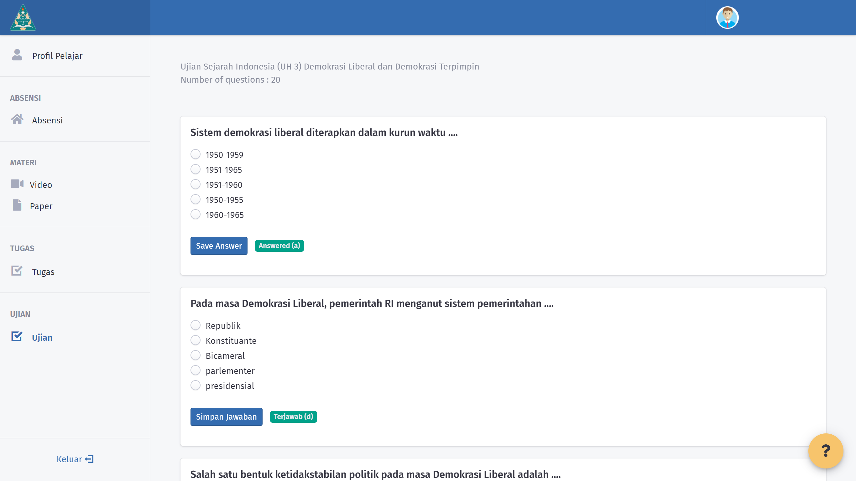
Nothing too fancy, but let's go through the flaws:
You are supposed to click on
Save Answerfor every single question.
While this may be fine, it is rather annoying to click on it for every single one, not to mention the time to wait for the server to respond. In this era, it is possible to send all of this in the background, the platform already have jQuery, then make use of it. Use theonChangeevent. This way you don't require everyone to click on it.The
Save Answerbutton is rather misleading.
One would expect the button is to save the answer, so that it will not be erased upon refresh or the likes. However, the reality is that the button doesSave and Lock Answerinstead. This surely gives more stress to the students as they should not push the button until they're 100% certain with their answer.Performance is horrendous.
The performance of the site makes it totally unusable, every time you press theSave Answerbutton, it sends a POST request to the server, and it takes 1.2 minutes in average for the server to respond back! On top of it, it will also redirect you to the same page and makes your browser send a GET request of the page, that takes 40 seconds in average for the server to deliver. That would basically take almost 2 minutes for everything to come back usable again. It is unbelieveable on how unresponsive it is to wait.
Not only that, you're also often greeted with a blank/timeout page that is actually just the server sending a 500 Internal Server Error HTTP response.
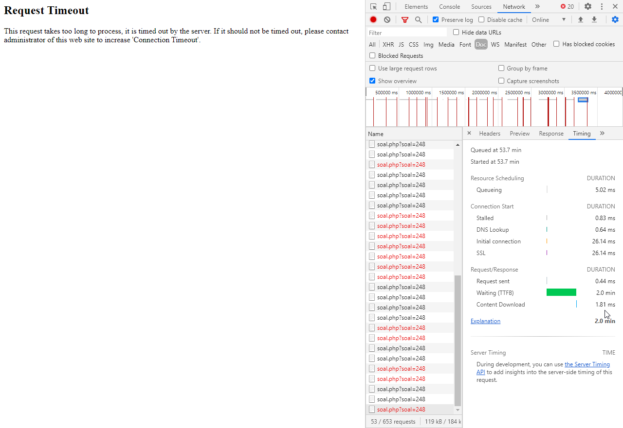

Here's a video of me answering one question:
Remarks
Overall, I am rather annoyed with all of the flaws, especially one specific subject often uses it. It really is a pain in the ass for me to navigate through it. There are actually many more flaws that I could mention in this post, but it will cause some sort of world destruction if I say it publicly.
There are many ways to improve it, here are some:
- Make use of jQuery's
onChangeto ACTUALLY save answers. - Fix the button, or even remove it once above is applied.
- Optimize database calls.
- Get a better server, seriously.
That's it, I guess. Have a nice day.